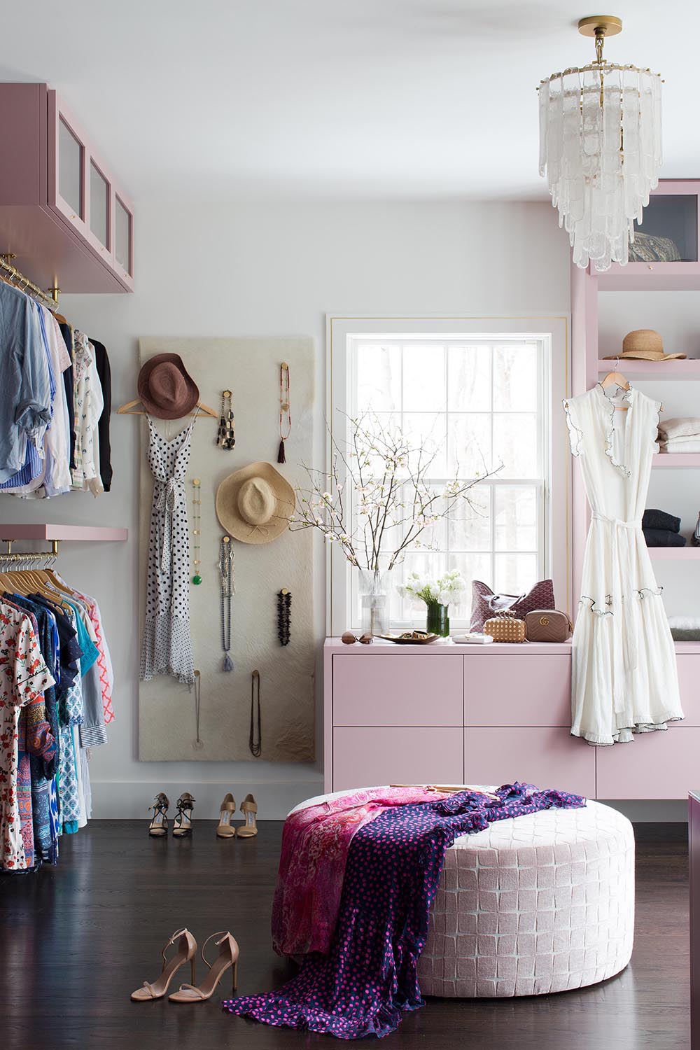
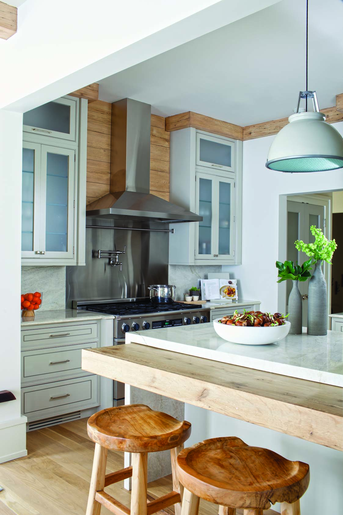
What a dressing closet! The perfect start as we head into the weekend. Our master plan was key as we prepared for all the proper storage, maximized hanging, and creative jewelry display.
Tag: fashion
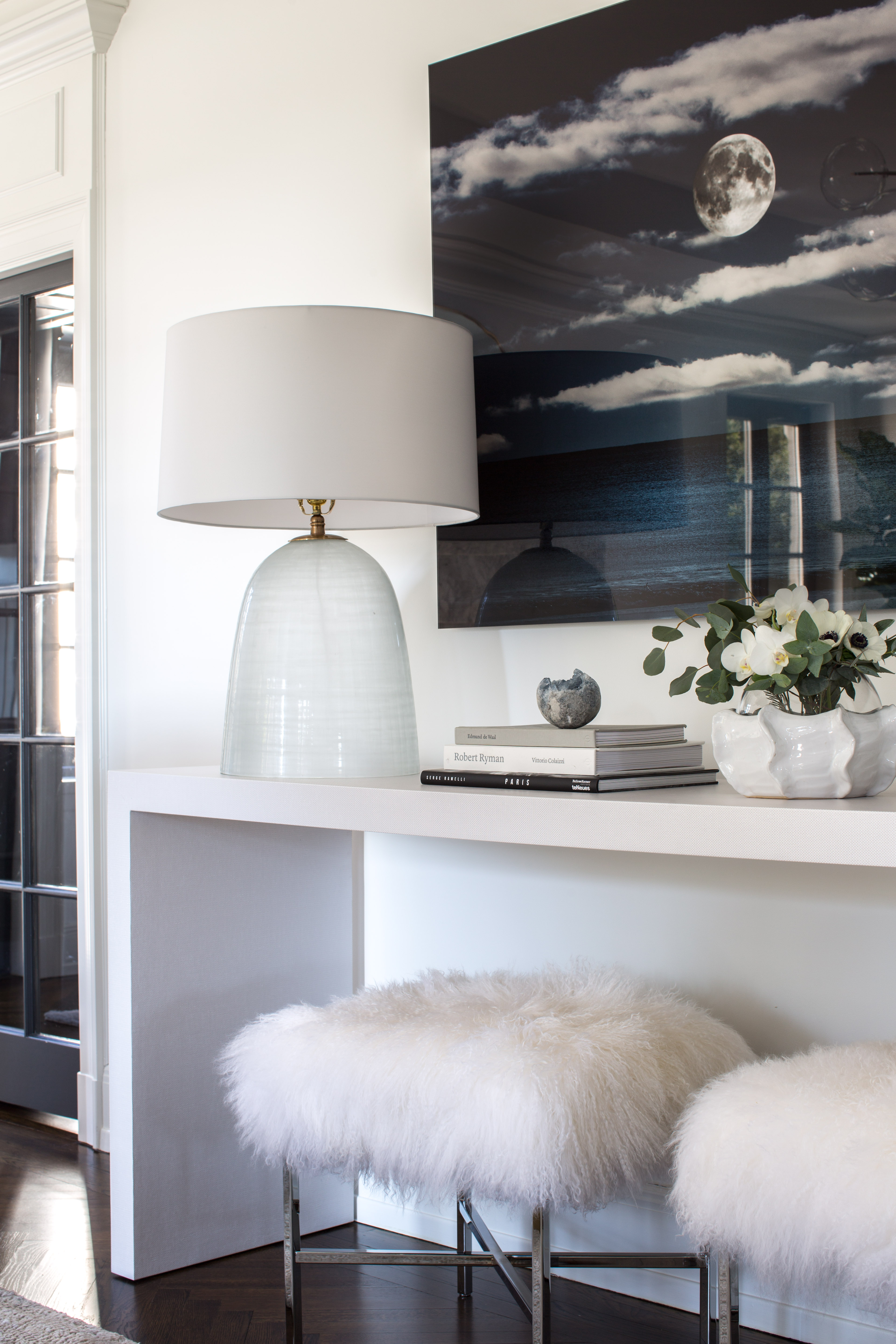
BY THE LIGHT OF THE MOON
📷 Mixit, Inc.
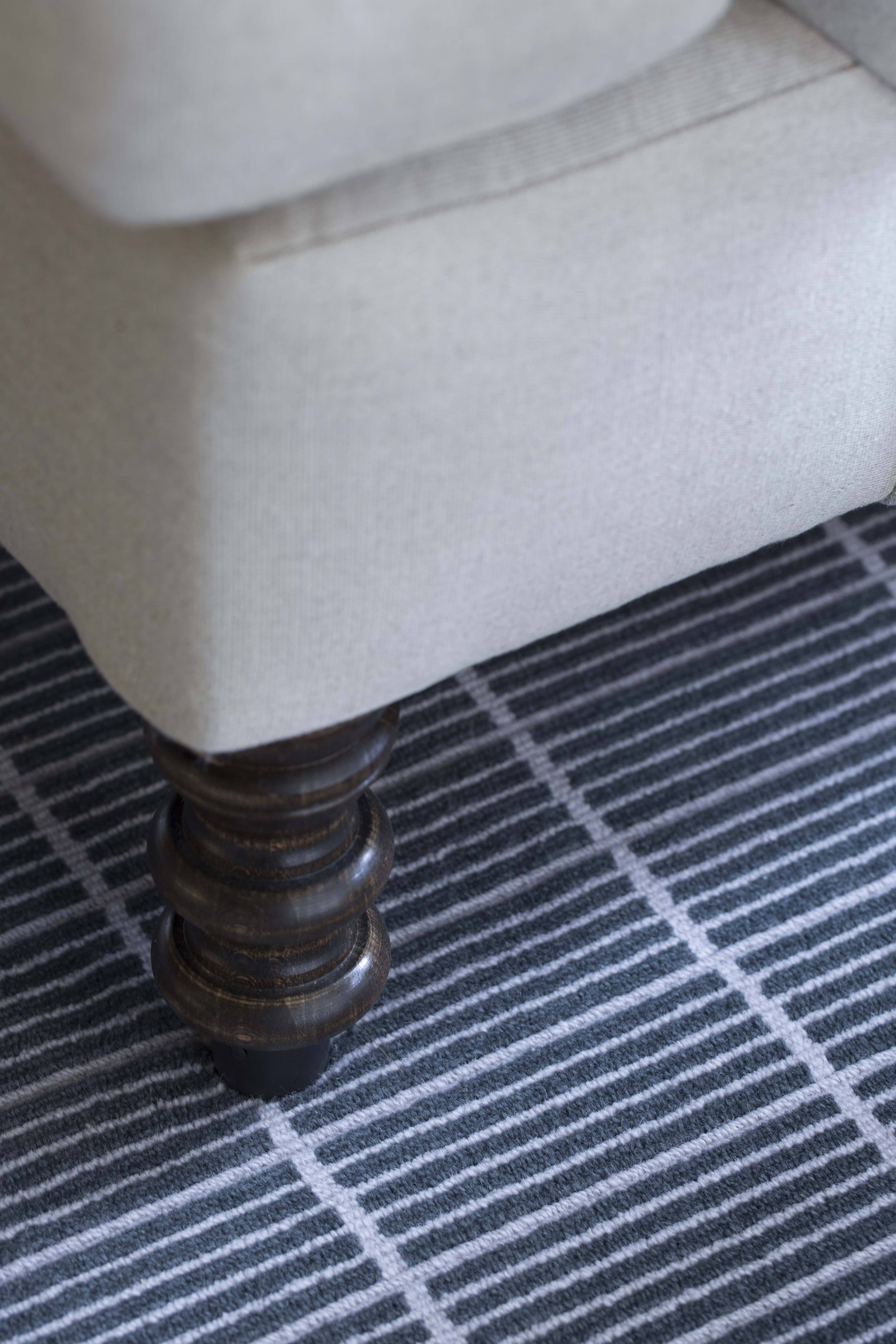
GRID
📷 Mixit, Inc.
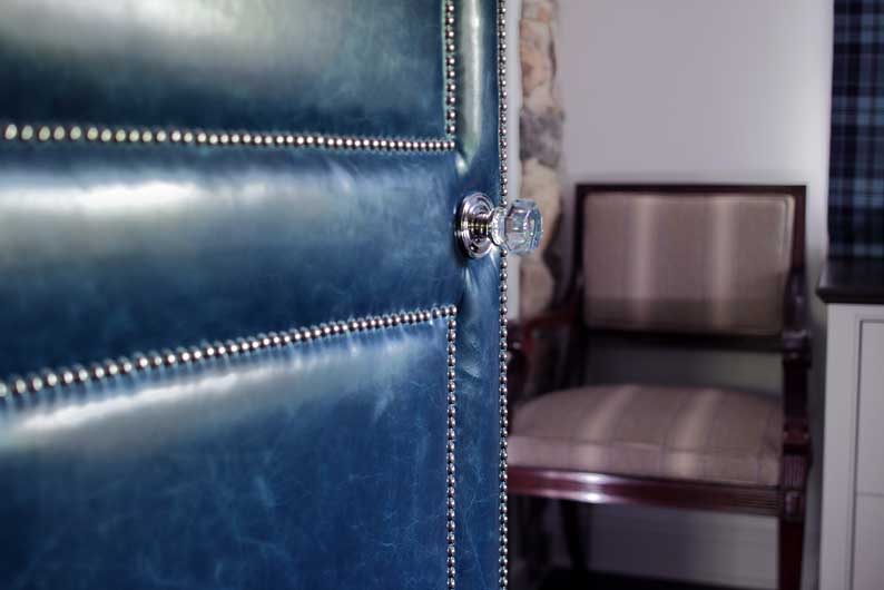
UPHOLSTERED
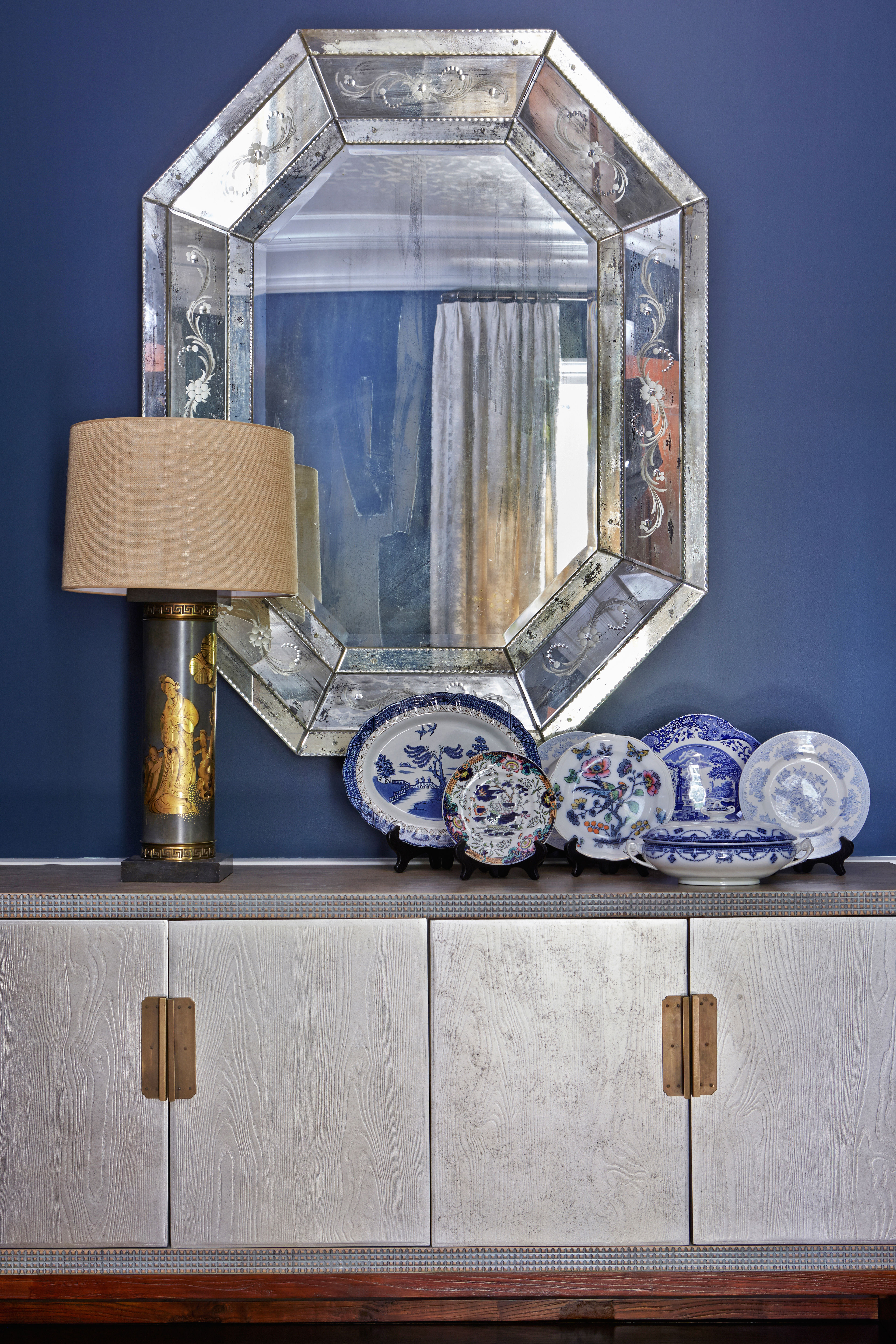
REFLECTIONS
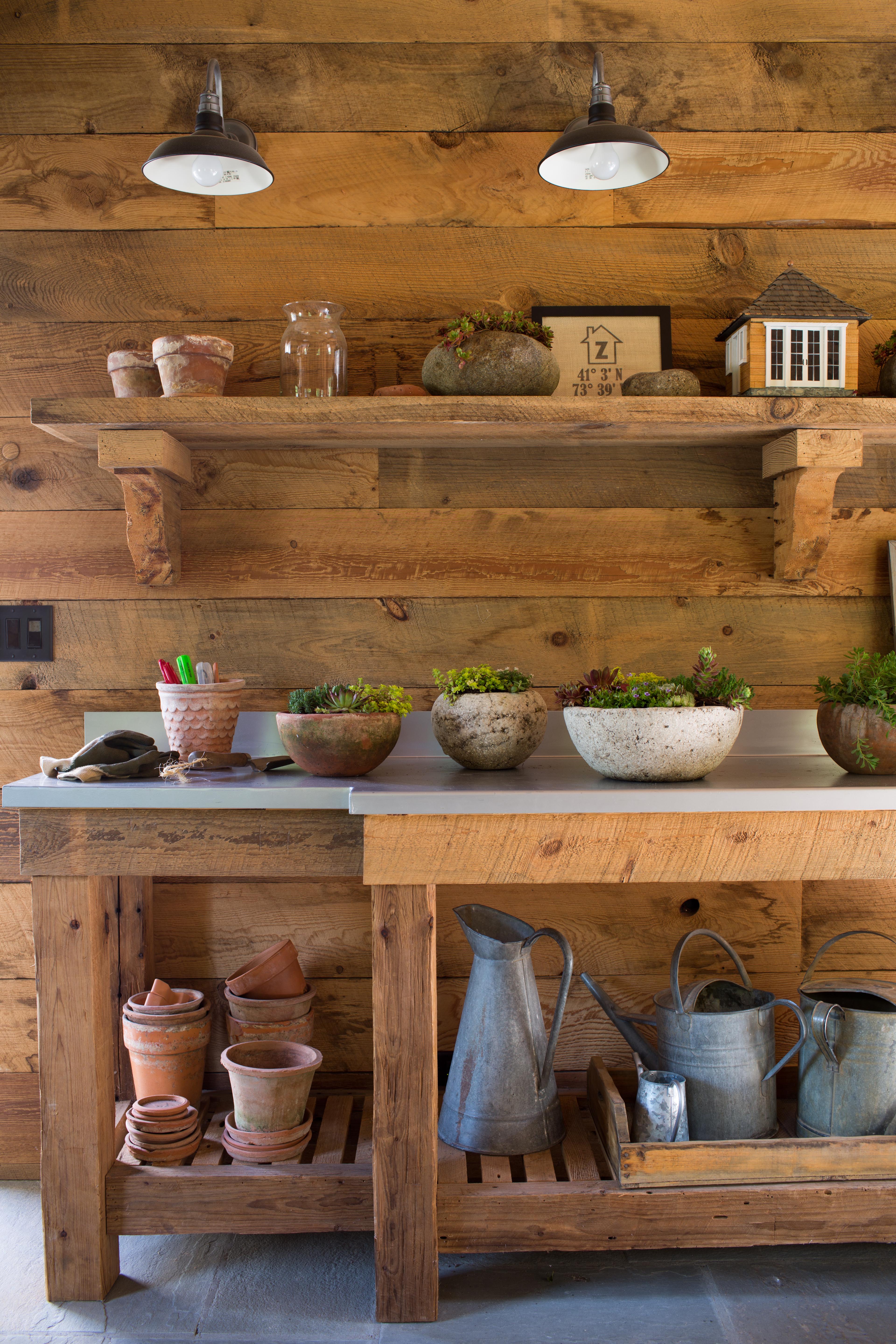
G R E E N T H U M B
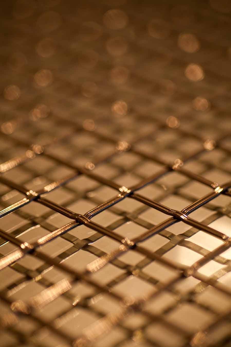
C H I C K E N W I R E
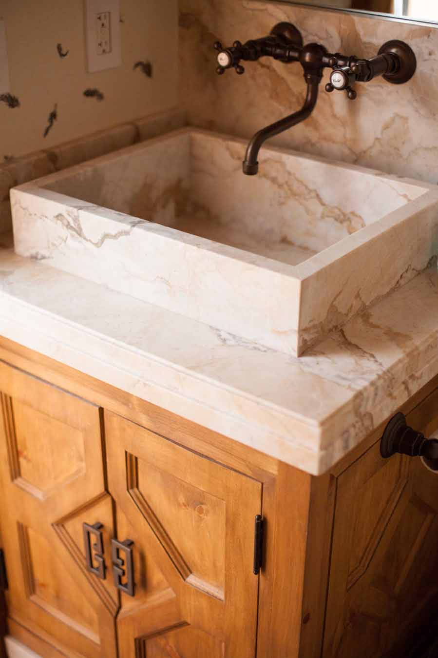
S T O N E V E S S E L
O R G A N I C
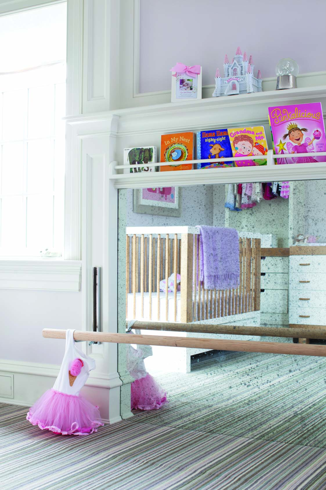
Problem solved. What was once a fireplace, we turned into the perfect spot for a ballet bar.